The 10 Most Popular New Kitchens Right Now
Get ideas for warm neutral color schemes and other stylish elements from these new kitchen photos.
Warm neutral color palettes are having a moment. And you’ll see plenty of welcoming examples in this countdown of new kitchen photos. You’ll also find elegant details that form a “quiet luxury” style, as well as design ideas for creating contrast, incorporating wood elements and devising practical layouts.
By: Suzanne Ennis
10. Open and Organic
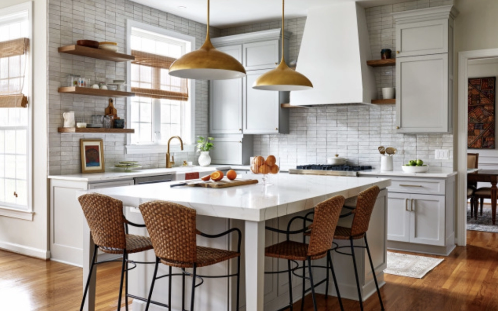
This Washington, D.C.-area kitchen by Case Architects & Remodelers exemplifies the handmade features and neutral palette popular in kitchens right now. Hand-cut zellige-style backsplash tiles coordinate with marble-look Corian countertops and soft greige Overcast paint on the Hampstead door fronts from Crystal Cabinets. Red oak shelves in a Sand Dune finish, woven seating, reddish wood floors and golden pendant lights add contrast and coziness.
9. A Little Bit French Country
In this renovated Portland, Oregon, kitchen, Kraft Custom Construction balanced the dark wood floor and medium-toned wood perimeter cabinets and beams with a white island, light stone countertops and a white subway tile backsplash. The improved flow and ample storage and counter space satisfied the homeowners’ need for a highly functional room. Traditional details give the space a sense of quiet luxury, while the rustic beams and curved range hood help achieve the homeowners’ desire for French Country flair.
8. Zesty Zellige
A handmade zellige tile backsplash in a multicolor geometric pattern behind the cooktop is the star of this Huntington Beach, California, kitchen, while the two-tone Italian custom laminate cabinets play supporting roles. Joseph Rodrigues Interiors complemented them with neutral zeillige wall tile, light engineered quartz countertops and luxury vinyl plank flooring to create a light and warm kitchen with clean, contemporary lines and plenty of pizzazz.
7. Two-Tone Traditional
Kalaa Chakra Interiors contrasted a richly grained wood island base with creamy painted perimeter cabinets in this Atlanta-area kitchen, then installed a soft green tile backsplash that echoes the verdant view through the windows. The large scale of the lantern-style brass pendant light subtly updates the traditional design.
6. Twin Fridges
The softness of marble-look quartz countertops and pale green (Sea Salt by Sherwin-Williams) and warm white oak cabinets contrasts with bold black ceiling trim and door trim in this Kansas kitchen. Other standout features incorporated by Tamara Day Design (who used Houzz Pro business software to manage the project) include matching refrigerators flanking the cooking zone and a white oak bar countertop with waterfall ends.
5. Angles and Curves
When remodeling this Missouri kitchen, Marcia Moore Design preserved the stone island countertop in a distinctive wedge shape but replaced the base with black and walnut grain cabinets to give the space a subtle European vibe. Black-and-brown quartz perimeter countertops and geometric backsplash tile in four different honed marbles pick up the island’s varied tones.
4. Warm and Milky
In this Minnesota kitchen by Ksusha Olson of Titus Contracting, inset kitchen cabinetry painted in Benjamin Moore’s Pale Oak greige creates a warm neutral backdrop for the Calacatta Laza quartz countertops, which are milky white with soft brown veining. A contrasting dark-stained white oak island base and coordinating woven counter chairs ground the light and airy space.
3. Earthy and Eclectic
The colors in this Aspen, Colorado, kitchen designed by Miranda Cullen of Inside Stories may be warm neutral, but the style is anything but bland. Varied textures and tones — such as the custom cabinets’ dual white oak finishes and the quartz countertops’ sweeping veins — add depth and character. Meanwhile, the lineup of Folk Abigail pendant lights from Rejuvenation and the range backsplash and hood tiles (Ann Sacks Gem by Kelly Wearstler in Azure) say “look at me!” without being flashy.
2. Textured Touches
This Studio M Interiors-designed kitchen in Minneapolis combines soft gray-blue perimeter cabinetry with a contrasting light wood island base. Repeating the wood in vertical panels on the range hood and as trim in the arched doorway helps tie the look together in an unexpected way. Creamy white countertops, domed white pendant lights, white-painted walls and a textured white subway tile also work together to create the room’s cohesive feel.
1. Refined Palette
White, wood and black work handsomely in this transitional-style Dallas-area kitchen by Spruill Custom Homes. The glass fronts of the uppermost cabinets emphasize the tall ceilings and offer display space, and bold black cabinet hardware and conical lights from Rejuvenation punctuate the otherwise pale palette.